Graphing
Line Graph
Line graphs are useful for making predictions and for interpreting data that wasn't directly collected. They allow educated guesses for future results and for earlier results in some cases.
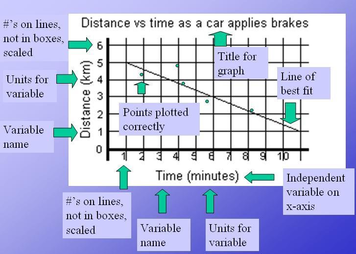
- To create a proper line graph, start by creating a set of axes.
- Count three boxes up from the bottom of a sheet of graph paper and use the top of the third box as a guide for your x-axis.
- Next, count three boxes in from the left side and use the line as a guide for drawing the y-axis.
- Your independent variable goes on the x-axis.
- Look at its largest value and also count the boxes going horizontally across the page.
- Figure out what you need to count by in order to make the data fit.
- Always count in a pattern. Never use the data itself to mark your axis.
- Write the name of the variable and the unit it was measured in.
- On the y-axis, repeat this process for the dependent variable.
- Next, plot your points on the graph.
- It is better to use a line of best fit so you can see trends clearly, but you can also connect the points dot-to-dot.
- The last thing your graph needs is an appropriate title.
Bar Graph
Bar graphs are useful for counted data but aren't generally useful for making predictions about unknown data. Data that shows the number of people with blue eyes and brown eyes doesn't help with predictions for those with hazel eyes, etc. Yet a bar graph is useful for comparing sets of groups to see which set is larger.
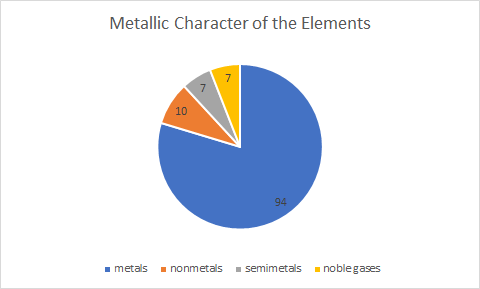
Pie Chart / Circle Graph
A pie chart represents the percentages of a larger whole. A pie chart could be made of the types of atoms on the periodic table, for instance. If 75% of the chart is metals, and 15% is nonmetals, that leaves the other 10% for metalloids. Like a bar graph, a pie chart is useful for comparing group sizes in relation to each other, but a pie chart is intended to represent all the collected data, getting up to 100%.